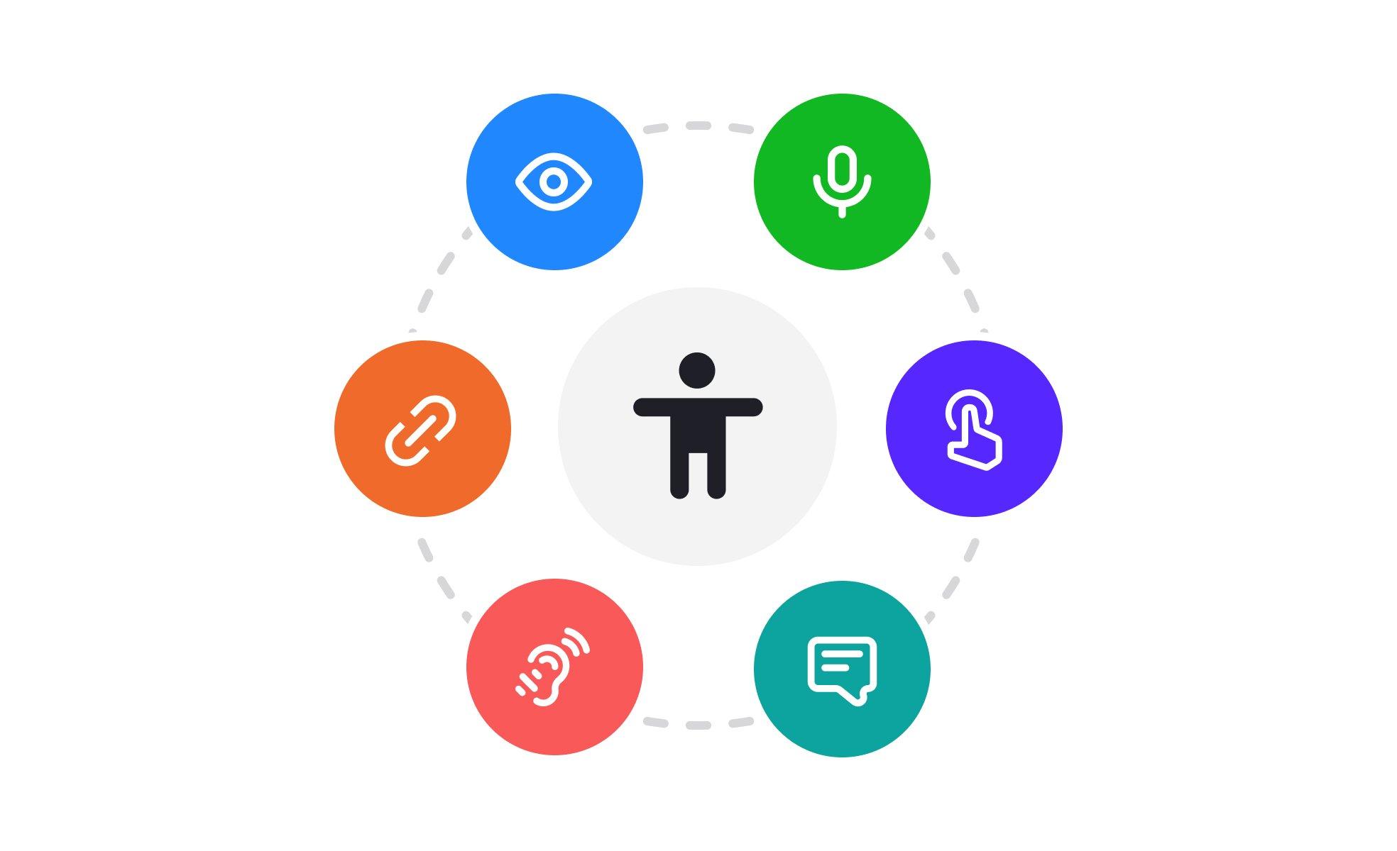
Imagine a world where every brand’s ambassador – their mascot – is not only a symbol of fun and excitement, but also a beacon of inclusivity. At the forefront of this movement is the Promise Mascot Agency, a pioneering force that is reshaping the world of marketing mascots with a critical eye on accessibility. From design to deployment, every aspect of their mascot creation process is being carefully crafted to ensure that these beloved brand ambassadors are accessible to everyone, regardless of ability or need. In this article, we delve into the story of how Promise Mascot Agency is being built with accessibility in mind, and what this means for the future of inclusive branding.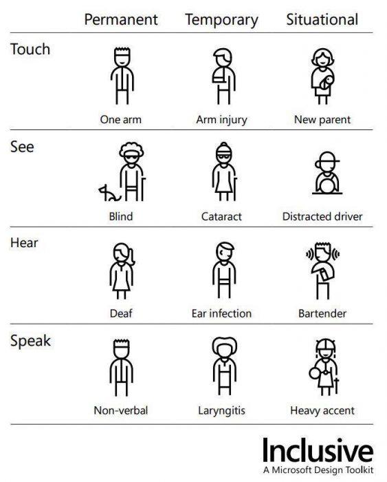
Embracing Inclusive Design from the Start
At Promise Mascot Agency, we acknowledge the importance of creating an environment that’s welcoming to everyone. It’s not just about meeting the minimum requirements; it’s about proactively considering the diverse needs of our users and making conscious design decisions to ensure that everyone has an equal opportunity to engage with our platform.
We’ve incorporated accessibility into our design process from the start, with a focus on user-centered design principles. This involves going beyond just compliance, and instead, thinking about how our design choices can impact real people. Here are some ways we’re embedding accessibility into our design DNA:
- WCAG guidelines: We’re committed to adhering to the Web Content Accessibility Guidelines (WCAG 2.1), ensuring that our platform meets the highest standards of accessibility.
- Inclusive design workshops: Our design team participates in regular workshops and training sessions to stay up-to-date on the latest accessibility trends and best practices.
- User testing: We involve users with diverse abilities and needs in our testing process to ensure that our platform is usable and accessible for everyone.
- Accessibility audits: Regular audits help us identify areas for improvement, allowing us to continuously refine and enhance our accessibility features.
| Accessibility Features | Description |
|---|---|
| Color Contrast Ratio | |
| Alternative Text | We provide alt text for all images, allowing screen readers to convey the content to users with visual impairments. |
| Screen Reader Compatibility |
Breaking Down Barriers in Brand Development
In today’s fast-paced digital landscape, creating an inclusive brand that caters to diverse audiences is no longer a luxury, but a necessity. This realization has been at the forefront of Promise Mascot Agency’s development from its inception. By focusing on the World Wide Web Consortium’s Web Content Accessibility Guidelines (WCAG 2.1), the agency ensures that its brand is not only accessible but also enjoyable for everyone.
Here are some key strategies being implemented to break down barriers in brand development:
- WCAG 2.1 Compliance: Ensuring all digital platforms, including the website and social media, comply with the latest accessibility standards.
- Contrasting Color Schemes: Selecting colors that provide sufficient contrast for users with visual impairments, making the content more readable.
- Screen Reader Optimization: Optimizing content and visuals for seamless integration with screen readers, enabling users with visual impairments to navigate the platform easily.
- : Providing closed captions for audio/visual content to cater to users with hearing impairments.
| Accessibility Features | Description |
|---|---|
| Screen Reader Navigation | Navigating through screen reader, exploring pages and elements. |
| High Contrast Mode | Switching to a high contrast color scheme for better readability. |
| Large Text Option | Scaling up font sizes for improved readability. |
The Crucial Role of Color and Contrast
Color and contrast are fundamental elements in designing an inclusive and accessible environment, especially in the digital realm. To ensure our agency’s platform is usable by a diverse range of people, we’ve carefully crafted a color palette that provides a harmonious balance between aesthetics and functionality.
We achieved this by selecting colors with sufficient contrast ratios, considering the Web Content Accessibility Guidelines (WCAG 2.1) for color contrast. This ensures that users with visual impairments or those accessing our platform in a variety of lighting conditions can easily distinguish between different elements on the page.
| Color Combination | Contrast Ratio | WCAG Compliance |
| Background #F7F7F7, Text #333333 | 4.54:1 | AA |
| Background #333333, Text #F7F7F7 | 4.34:1 | AA |
- We’ve avoided using color as the sole means of conveying information, ensuring that all visual elements, such as charts and graphs, include alternative descriptions or labels.
- In addition to color, we’ve utilized other visual design elements, like size and shape, to differentiate between interactive elements, such as buttons and input fields.

Crafting Clear and Concise Communication
At Promise Mascot Agency, we believe that communication is key to creating an accessible experience for everyone. This is why we’re incorporating clear and concise communication into the very fabric of our agency. When it comes to marketing, branding, and social media presence, we strive to be inclusive of all users. We believe in using simple language, active voice, and avoiding unnecessary jargon.
We’ve created a set of guidelines to help us ensure that our content is accessible to all. Here are some key aspects of our guidelines:
- Clear headings: We use proper headings (H1-H6) to create a clear structure for our content.
- Concise paragraphs: We keep our paragraphs short and to the point, making it easier for users to scan and understand our content.
- Simple language: We avoid using complex vocabularies or technical terms that may be unfamiliar to our users.
| Accessible Communication Checklist | ||
|---|---|---|
| Clear and concise headings | Simple language | Active voice |
| Avoiding jargon and technical terms | Using bullet points and numbered lists | Providing alternative text for images |
By following these guidelines, we can ensure that our communication is accessible and inclusive for all users, regardless of their background, abilities, or language proficiency.
Prioritizing Navigation and User Experience
As we build Promise Mascot Agency, our development team focuses intensely on implementing clear and simple navigation, recognizing its crucial role in creating an optimal user experience. This dedicated approach includes creating a menu structure that logically groups related pages together, making it easier for users to navigate our website. We prioritize search functionality, effectively providing users with alternative pathways to discover content without relying on menu navigation. Moreover, by crafting the website’s main sections in a centralized format, we enhance discoverability and ensure that users quickly find necessary content.
Evaluating the performance of navigation elements involves detailed analysis and rigorous user testing. Our testing protocols examine various key factors:
- Initial Load Speed: We monitor how quickly our web pages load to ensure that navigation is never compromised by slow or inconsistent loading times.
- Breadcrumbs and Trails: We deploy breadcrumb paths, enabling users to quickly understand their navigation trail through our website, effortlessly returning to earlier pages.
- Redirect Links: We carefully implement redirects for decommissioned or renamed pages to eliminate dead links, ensuring that existing bookmarks function correctly.
| Responsive Elements | XLS | Desktop | Navigation |
| :———————————— | :—————-: | :————–: | :————————-: |
| Tab Menu and Mobile Navigation | | | |
| Scrolling Areas and Buttons | | | |
| Menu Titles and Highlight Colors| | | Prominent Visibility |
| Screen Reader Identifiers | | | |
Empowering Individuals through Flexible Interactions
At the heart of Promise Mascot Agency’s values lies a commitment to inclusivity and equal access. By designing our platform with flexibility in mind, we’re creating opportunities for users of all abilities to engage with our mascot services. This means incorporating features such as text-to-speech functionality and high contrast display options, allowing users to navigate our platform in a way that suits their needs.
To achieve this goal, we’ve established a set of accessibility guidelines that inform every aspect of our design process. These guidelines include:
- Clear and consistent navigation
- Alternative text for images
- Colour contrast that meets Web Content Accessibility Guidelines (WCAG 2.1)
- Closed captions for video content
| WCAG 2.1 Guidelines | Our Implementation |
|---|---|
| 4.5 Megabytes or less for page size | Optimize images and compress files to reduce page load times |
| Minimum colour contrast ratio of 4.5:1 | Ensure that all interactive elements and graphics meet the required contrast ratio |
| Provide alternative text for images | Use descriptive text for all images, graphs and charts |
By considering the diverse needs of our users, we’re creating a platform that’s accessible, adaptable, and empowering.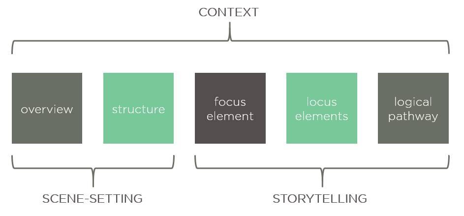
Forging Stronger Connections with Accessible Storytelling
At the heart of Promise Mascot Agency lies a deep understanding of the importance of connection and community. Effective storytelling is essential in creating a sense of belonging and fostering meaningful relationships between individuals. However, not everyone experiences stories in the same way. This is where accessible storytelling comes into play – a thoughtful and intentional approach that considers the diverse needs of the audience. By incorporating elements such as clear navigation, descriptive headings, and concise language, we ensure that our stories are accessible to a wider range of people.
Our approach to accessible storytelling is centered around the following key principles:
Clear and consistent language
Descriptive and concise headings
Simple navigation and easy-to-follow structures
Inclusive and diverse representation
| Storytelling Element | Accessible Feature | Why it Matters |
| — | — | — |
| Headings | Descriptive and concise titles | Helps users with visual impairments or screen readers navigate the story more easily. |
| Language | Clear and simple vocabulary | Ensures that the story is understandable to a broader audience, including those with disabilities or English language learners. |
| Navigation | Clear and logical structure | Facilitates easy navigation and reduces confusion, making the story more engaging and enjoyable for all users. |
Final Thoughts
As the Promise Mascot Agency continues to take shape, one thing is clear: accessibility is not just an afterthought, but a guiding principle. By prioritizing inclusivity and user-centered design, the agency is setting a new standard for what it means to be a welcoming and empowering creative space. As we look to the future, it’s exciting to think about the possibilities that will unfold when creativity knows no bounds – and neither do the opportunities. With its commitment to accessibility at the forefront, Promise Mascot Agency is poised to make a lasting impact, one promise at a time.

